
 ]
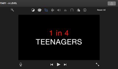
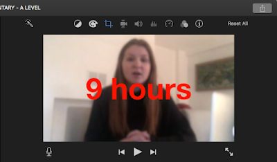
]I changed the font of my titles to Helvetica Neue as I felt this font fitted my brand better. I also put some of the facts and words from the question in red. As colour scheme throughout my newspaper advert and my TV listings review is red and white I thought that including red in some of the titles would help to continue a house style and brand identity. The colour scheme helps to show the connection between the documentary and the ancillary products.
No comments:
Post a Comment