Thursday, 21 December 2017
Wednesday, 20 December 2017
Tuesday, 19 December 2017
Monday, 18 December 2017
Research - Audience Feedback 2
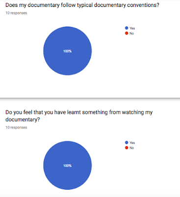
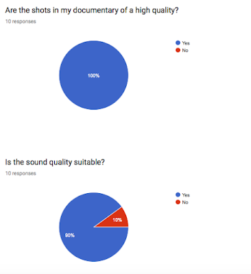
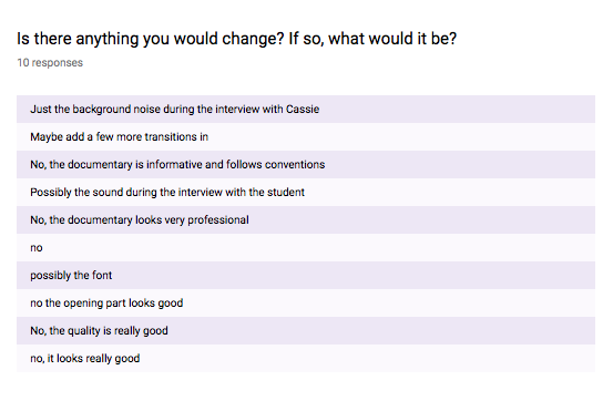
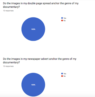
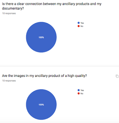

After making the improvements from I had received on my first audience feedback questionnaire, I sent out another questionnaire with my updated products and some similar to questions that will help me to make sure my products look good and appeal to my target audience, but will also help me to see what I need to improve.
I received less improvements than I had gotten last time, which shows that my documentary was better than it was the first time I had sent it.
Most of the comments targeted the same specific area, such as the noise level on one of the interviews. This was extremely helpful because I was able to focus on specific details that would make my documentary look more aesthetically pleasing and appeal to my target audience.
Thursday, 14 December 2017
Production - Interviews
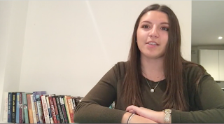
I got another interview with a Sociologist undergraduate as my audience feedback stated that I should get another interview in order to give another perspective on the topic. I cropped the interview so that the subject is in the right of the frame (rule of thirds) as this looks more aesthetically pleasing and also follows documentary interview codes and conventions. I will place these interviews side by side my other interview in order to see how their views compare.
Tuesday, 12 December 2017
Production - Presenter Shots

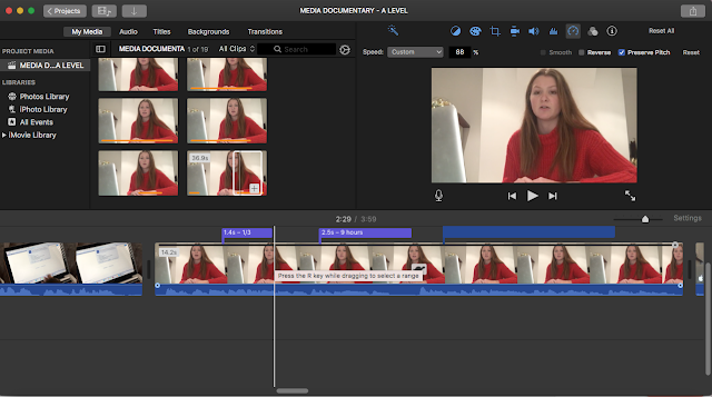
Soem fo the feedback I received from my audience feedback said that some of the presenter shots were quite 'grainy' and not very bright, which I agreed with. I re-filmed the shots with a brighter light and a higher quality in order to make the shots looks more professional and aesthetically pleasing.
Sunday, 10 December 2017
Production - Documentary Opening Sequence
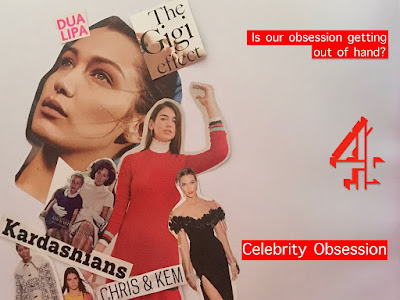
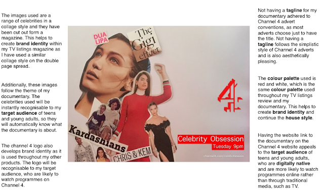
The audience feedback stated that I should remove the 'Tuesday 9pm' section of my ad when using it as the title page in my documentary. I have removed this because I think that it will look more aesthetically pleasing this way and adhere to conventions of documentary titles that do not tend to have the date in their opening sequence. I also removed the website as again this did not adhere to conventions and looked more aesthetically pleasing without the website link.
Friday, 8 December 2017
Production - Titles and fonts
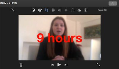 ]
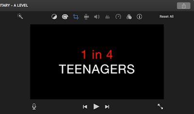
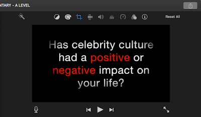
]I changed the font of my titles to Helvetica Neue as I felt this font fitted my brand better. I also put some of the facts and words from the question in red. As colour scheme throughout my newspaper advert and my TV listings review is red and white I thought that including red in some of the titles would help to continue a house style and brand identity. The colour scheme helps to show the connection between the documentary and the ancillary products.
Wednesday, 6 December 2017
Production - Pull focus
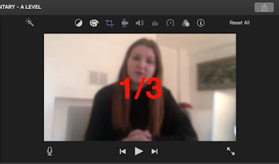
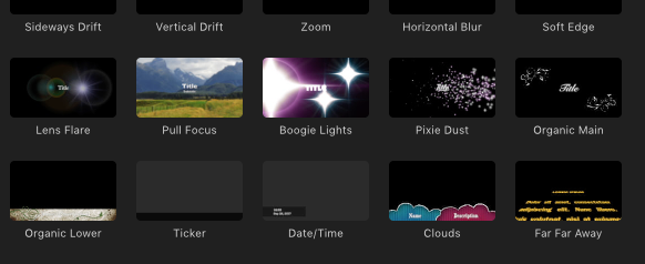
When originally adding in my facts and statistics over what I was saying, I wanted to blur out the presenter in the background in order to ensure that the audience's focus is on the statistic and also follow documentary codes and conventions. I managed to do this by dragging the pull focus from the 'titles' section on iMovie over my text and this helped to blur out the background a little bit.
.
Tuesday, 5 December 2017
Production - Editing Titles
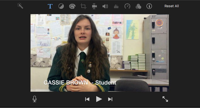
I originally did not include the name of the interviewee over the footage of the interview. However, I think including the name and their occupation will give context to the audience and may also help the audience relate to the interviewee (Blumer and Katz Uses and Gratifications theory - relationship).
I have used the same font that I have used throughout the rest of my documentary in order to ensure continuity in the documentary. However, I will get some feedback from my focus group and audience to see if the subtitle is suitable.
Monday, 4 December 2017
Production - Editing Sound
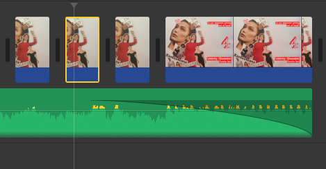
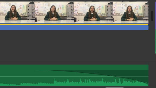
One of the improvements that I received on my audience feedback results was that I should make the music from the opening sequence and the music behind the interviews fade out rather than just stop abruptly because that did not sound good or follow documentary codes and conventions. At first I was unsure of how to make the music fade out but I managed to pull out the little dots at the end of the audio, which allowed the music to gradually fade out. I was able to adjust this to how I wanted and I will get more feedback from my focus group to see if the fade out sounds appropriate.
Saturday, 2 December 2017
Production - TV Listings Improvements

After reading through my audience feedback I made some changes to my TV listings review. I changed the pull quote to red as this was some of the feedback I received. The feedback also said to change the font of my review so I changed the font to Adobe Garamond Pro as I felt this font looked more professional. In addition to this, I also added in the masthead from 'RadioTimes' magazine alongside the page numbers in order to show that this review is from a TV listings magazine. This is a common convention that is seen in magazines.
Thursday, 30 November 2017
Research - Audience Feedback
I created a questionnaire in order to get some audience feedback and I sent this out to my media class (who are in the same demographic as my target audience), as well as my focus group. The responses I received back were really helpful and gave me an insight into what I needed to change to make my products look better to my audience.
Everyone who answered the questionnaire agreed that my documentary follows typical documentary codes and conventions and that my ancillary products anchor my documentary. In addition to this, everyone agreed that the red font used throughout the ancillary products looks effective and aesthetically pleasing.
However, the audience feedback also gave me ideas of what I need to improve. I will make sure to make the pull quote on the TV listings review red, I will also include another interview in my documentary, either of a student or an older person. I may also re-film some of my narrator shots, in order to improve the sound quality and the image quality, as some of the shots were quite 'grainy' or 'quiet'.
Monday, 27 November 2017
Saturday, 25 November 2017
Research - Statistics for Documentary
I wanted to get some more statistics for my documentary about how many hours per day teens are roughly spending on their phones in order to explain how and why teens are being constantly exposed to celebrity culture and updates.
I found an article on the Washington Post about this.
The article said that teens are spending one third of their day, which is around 9 hours per day on the phone. I will include these statistics in my documentary.
Thursday, 23 November 2017
Production - TV Listings Review DRAFT
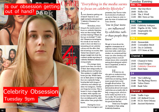
Here is a draft for my TV listings review. I have tried to continue the house style of my newspaper advert and documentary through having the same title on the image. I have also tried to follow typical codes and conventions that I have seen in other TV listings review.
I will send this final image to my focus group and gain some audience feedback so I know what I need to change and what I don't need to change.
Tuesday, 21 November 2017
Production - Editing TV Listings Review
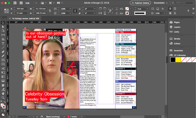
I made to have the six column guidelines when designing my double page spread so that the spread follows typical magazine codes and conventions and looks aesthetically pleasing to the audience.
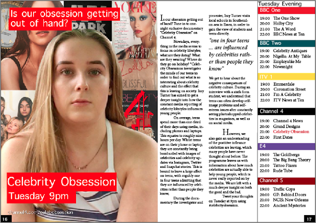
I also made sure to include a pull quote from the copy because this follows codes and conventions of magazines. It also helps to engage the audience and let the audience know what the article/programme is about.
As there is no headline yet, I may include a quote from the copy as my headline or may add a headline in. However, I will get my focus group to feedback on what they think.
Monday, 20 November 2017
Production - Editing Images on Photoshop
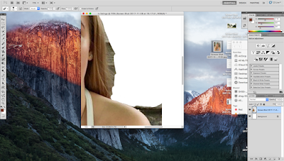
After taking my images for my double page spread, I removed the background of the images in photoshop. I then enlarged the main image of my presenter in order to have the image in the centre of the page. I also then placed my smaller images in a collage style behind the central image. I placed them in a collage style because this is similar to magazines, which follows the style of my genre.
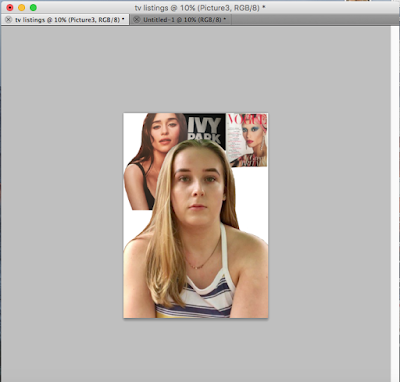
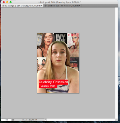
After I had edited and arranged all of the images in the way that I wanted, I included my title. I wanted to make it the same as the title on my newspaper advert because this would continue a house style and show the connection between the two ancillary products.
Sunday, 19 November 2017
Production - TV Listings Review Images


Here are the images I took that will go behind my main image in a collage style way on my TV listings review. I have chosen these image because I feel that they represent celebrities and brands, which is what my documentary is about. For example, 'Ivy Park' is Beyoncé's brand and the perfume is famous Youtuber Zoella's brand. My target audience will recognise these images and should realise the connection to my documentary
Saturday, 18 November 2017
Production - Editing Listings Review Images

For my double page spread, I have decided to use this image of a teen, who is in my target audience. I will place the image in the centre of the page and have a variety of other celebrity/brand related images behind her, almost in a poster style on one half of the page, with the article/review on the other half of the page.
I have decided to use an image of someone who would watch or be featured in the double page spread because this will follow conventions of documentaries that are a similar style to my own, such as other Channel 4 documentaries.


Both of these posters feature people who are actually featured in the documentary, or people from the target audience. Therefore, I am following conventions by including a teen who would be in my target audience in my double page spread.
Friday, 17 November 2017
Research - Newspaper Advert Audience Feedback

After originally designing my newspaper advert with a red colour scheme, I tried out a few more colours including grey and black. I then sent these three mock up adverts to my target audience and focus group in an audience feedback questionnaire to get their opinion. 80% of people said that they preferred the red colour palette so that is the colour I will use throughout all my products. I feel like red looks most aesthetically pleasing and is often associated with celebrities and fashion, therefore the colour will fit my documentary topic.
Subscribe to:
Comments (Atom)

