Thursday, 30 November 2017
Research - Audience Feedback
I created a questionnaire in order to get some audience feedback and I sent this out to my media class (who are in the same demographic as my target audience), as well as my focus group. The responses I received back were really helpful and gave me an insight into what I needed to change to make my products look better to my audience.
Everyone who answered the questionnaire agreed that my documentary follows typical documentary codes and conventions and that my ancillary products anchor my documentary. In addition to this, everyone agreed that the red font used throughout the ancillary products looks effective and aesthetically pleasing.
However, the audience feedback also gave me ideas of what I need to improve. I will make sure to make the pull quote on the TV listings review red, I will also include another interview in my documentary, either of a student or an older person. I may also re-film some of my narrator shots, in order to improve the sound quality and the image quality, as some of the shots were quite 'grainy' or 'quiet'.
Monday, 27 November 2017
Saturday, 25 November 2017
Research - Statistics for Documentary
I wanted to get some more statistics for my documentary about how many hours per day teens are roughly spending on their phones in order to explain how and why teens are being constantly exposed to celebrity culture and updates.
I found an article on the Washington Post about this.
The article said that teens are spending one third of their day, which is around 9 hours per day on the phone. I will include these statistics in my documentary.
Thursday, 23 November 2017
Production - TV Listings Review DRAFT
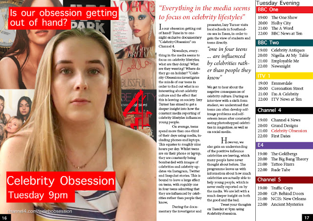
Here is a draft for my TV listings review. I have tried to continue the house style of my newspaper advert and documentary through having the same title on the image. I have also tried to follow typical codes and conventions that I have seen in other TV listings review.
I will send this final image to my focus group and gain some audience feedback so I know what I need to change and what I don't need to change.
Tuesday, 21 November 2017
Production - Editing TV Listings Review
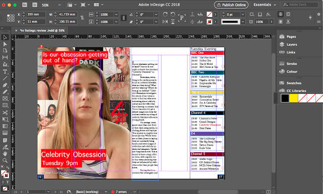
I made to have the six column guidelines when designing my double page spread so that the spread follows typical magazine codes and conventions and looks aesthetically pleasing to the audience.
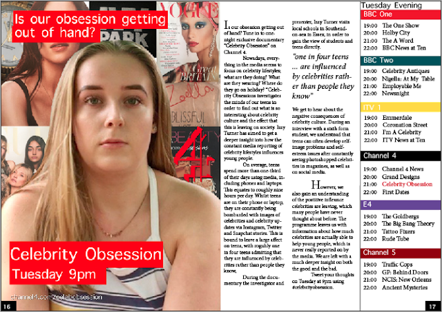
I also made sure to include a pull quote from the copy because this follows codes and conventions of magazines. It also helps to engage the audience and let the audience know what the article/programme is about.
As there is no headline yet, I may include a quote from the copy as my headline or may add a headline in. However, I will get my focus group to feedback on what they think.
Monday, 20 November 2017
Production - Editing Images on Photoshop
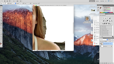
After taking my images for my double page spread, I removed the background of the images in photoshop. I then enlarged the main image of my presenter in order to have the image in the centre of the page. I also then placed my smaller images in a collage style behind the central image. I placed them in a collage style because this is similar to magazines, which follows the style of my genre.
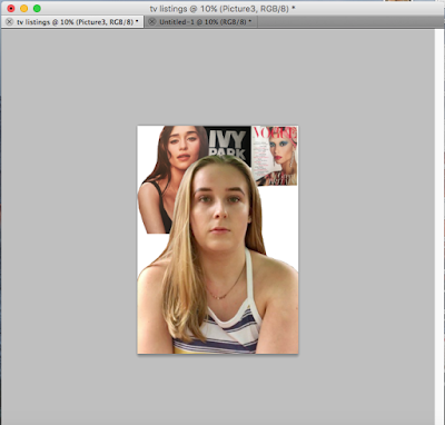
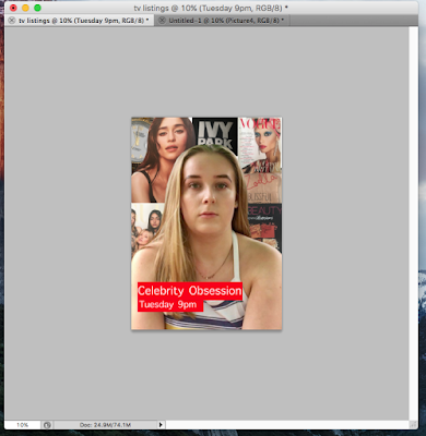
After I had edited and arranged all of the images in the way that I wanted, I included my title. I wanted to make it the same as the title on my newspaper advert because this would continue a house style and show the connection between the two ancillary products.
Sunday, 19 November 2017
Production - TV Listings Review Images


Here are the images I took that will go behind my main image in a collage style way on my TV listings review. I have chosen these image because I feel that they represent celebrities and brands, which is what my documentary is about. For example, 'Ivy Park' is Beyoncé's brand and the perfume is famous Youtuber Zoella's brand. My target audience will recognise these images and should realise the connection to my documentary
Saturday, 18 November 2017
Production - Editing Listings Review Images

For my double page spread, I have decided to use this image of a teen, who is in my target audience. I will place the image in the centre of the page and have a variety of other celebrity/brand related images behind her, almost in a poster style on one half of the page, with the article/review on the other half of the page.
I have decided to use an image of someone who would watch or be featured in the double page spread because this will follow conventions of documentaries that are a similar style to my own, such as other Channel 4 documentaries.


Both of these posters feature people who are actually featured in the documentary, or people from the target audience. Therefore, I am following conventions by including a teen who would be in my target audience in my double page spread.
Friday, 17 November 2017
Research - Newspaper Advert Audience Feedback

After originally designing my newspaper advert with a red colour scheme, I tried out a few more colours including grey and black. I then sent these three mock up adverts to my target audience and focus group in an audience feedback questionnaire to get their opinion. 80% of people said that they preferred the red colour palette so that is the colour I will use throughout all my products. I feel like red looks most aesthetically pleasing and is often associated with celebrities and fashion, therefore the colour will fit my documentary topic.
Thursday, 16 November 2017
Production - Editing Newspaper Advert
The image I chose to use was the final shot that I took when creating my moving picture introduction for my documentary. By using this image I hope to develop a house style and continuity.
I edited the image on Photos, adjusting the contrast and saturation.
Here is what the advert looks like after I added in my title, logo and tagline. I made sure that the tagline was a question because this was a common convention I saw on other channel 4 ads. Additionally, it will also hopefully act as an engima and encourage the audience to watch my documentary. I will send this copy to my focus group so that I can get some feedback on what to improve.
I edited the image on Photos, adjusting the contrast and saturation.

Here is what the advert looks like after I added in my title, logo and tagline. I made sure that the tagline was a question because this was a common convention I saw on other channel 4 ads. Additionally, it will also hopefully act as an engima and encourage the audience to watch my documentary. I will send this copy to my focus group so that I can get some feedback on what to improve.
Wednesday, 15 November 2017
Production - Channel 4 Font

I researched the Channel 4 font, which is titles 'Horseferry' and 'Chadwick'. However, it is not available for download because it has been copyrighted by Channel 4. In order to make my own newspaper advert look like it had been created by Channel 4, I tried to find a similar font. I ended up using the font 'Apple Symbols' because it was simple, aesthetically pleasing and fairly similar to the traditional Channel 4 font.

I also placed my titles in a red box because the red is the same colour as my channel 4 logo, which continues a house style and again red is aesthetically pleasing to the audience. Also, placing the text in boxes is a style that I have seen on multiple channel 4 newspaper adverts.


Tuesday, 14 November 2017
Planning - Magazine Listings Review
Double Page Spread Copy
Is our obsession getting out of hand? Tune in to one-night exclusive documentary “Celebrity Obsession” on Channel 4.
Nowadays, everything in the media seems to focus on celebrity lifestyles; what are they doing? What are they wearing? Where do they go on holiday? “Celebrity Obsessions investigates the minds of our teens in order to find out what is so interesting about celebrity culture and the effect that this is leaving on society. Izzy Turner has aimed to get a deeper insight into how the constant media reporting of celebrity lifestyles influences young people.
On average, teens spend more than one-third of their days using media, including phones and laptops. This equates to roughly nine hours per day. Whilst teens are on their phone or laptop, they are constantly being bombarded with images of celebrities and celebrity updates via Instagram, Twitter and Snapchat stories. This is bound to leave a large affect on teens, with roguhly one in four teens admitting that they are influenced by celebrities rather than people they know,
During the documentary the investigator and presenter, Izzy Turner visits local schools in Southend-on-sea in Essex, in order to gain the view of students and teens directly.
We get to hear about the negative consequences of celebrity culture. During an interview with a sixth form student, we understand that teens can often develop self-image problems and self-esteem issues after constantly seeing photoshopped celebrities in magazines, as well as on social media.
However, we also gain an understanding of the postitive infleunce celebrities are leaving, which many people have never thought about before. The programme leaves us with information about how much celebrities are actually able to help young people, which is never really reported on by the media. We are left with a much deeper insight on both the good and the bad.
Tweet your thoughts on Tuesday at 9pm using #celebrityobsession.
Saturday, 11 November 2017
Production - Removing Channel 4 Logo Background


After deciding on a red colour scheme for my newspaper advert because I think it matches my image and would be most aesthetically pleasing for my audience (I will check this with my focus group). However, as the background of my advert is not completely white, I had to remove the background of the channel 4 logo, which I was able to do in photoshop and made my advert look more professional and of a higher standard.
I will place the logo on the right hand side of the advert because this is a common convention that I have seen in other Channel 4 newspaper adverts.
Wednesday, 8 November 2017
Tuesday, 7 November 2017
Research - Findings from TV Listings Analysis
After researching into existing TV Listings magazines, I found a variety of different conventions that I will adhere to or challenge in my own TV listings magazine:
- Pull quotes
- Magazine masthead
- Magazine layout split into six columns
- Same colour palette continued throughout the magazine
- Variety of images
- Different coloured titles to differentiate between the TV channels
Monday, 6 November 2017
Thursday, 2 November 2017
Wednesday, 1 November 2017
Research - Findings from newspaper advert analysis
After researching into different documentary newspaper adverts, such as Channel 4's 'Seven Days' and Louis Theroux, I found a variety of different codes and conventions that I will either adhere to or challenge in my own newspaper advert.
- TV Institution logo (Channel 4 logo tended to be in the centre right hand side of the advert).
- Title ( Channel 4 title and tagline tended to be a white font with a coloured box surrounding the title)
- Tagline
- The day and time it starts
- Website link
- Image (either of the presenter or the subject of the documentary, tended to make direct mode of address with the audience).
Subscribe to:
Comments (Atom)


